How to build a customizable dashboard with tremor, recharts and react-grid-layout

Looking to craft a personalized dashboard that perfectly suits your data needs? You're in the right place! In this blog post, I'll guide you through the process of building a customizable dashboard using tremor and react-grid-layout.
To initiate our project, let's scaffold it using Vite with the command:
npm create vite@latest my-project
When prompted to select a framework, opt for 'React'.
Next, you'll be prompted to choose a variant. I opted for 'TypeScript'
Afterward, execute the following commands:
cd my-project
npm install
npm run dev
Congratulations! You now have an initial working project. Pretty straightforward, isn't it?

For further instructions follow this guide: https://www.tremor.so/docs/getting-started/installation
Now let's install react-grid-layout by running the following command:
npm install react-grid-layout
And... we're all set! Let's dive right into working on our project!
For each chart component, I'll utilize the Card and Title components to contain the chart itself. Depending on the desired chart type (all sourced from tremor), I'll integrate either a BarChart or a PieChart. Additionally, I'm gonna use the ResponsiveContainer component from the recharts library (which tremor relies on as a dependency) to ensure the chart fits neatly with the respective card.
export enum ChartVisualization {
  BarChart = "bar",
  PieChart = "pie",
  // Add other visualization types as needed
}

export interface Chart {
  title: string;
  eventSchemaId: string;
  visualization: ChartVisualization;
  property: string;
  x: number;
  y: number;
}

type ChartProps = ComponentProps<"div"> & {
  chart: Chart,
  data: { name: string; value: number; }[],
};
Let's craft a chart widget tailored to each specific type of chart we aim to showcase:
function BarDashboardChart({ data }: ChartProps) {
  return (
    <BarChart
      className="h-[90%]"
      data={data}
      index="name"
      categories={["value"]}
      colors={["blue"]}
      showLegend={false}
    />
  )
}

function PieDashboardChart({ data }: ChartProps) {
  return (
    <DonutChart
      className="h-[90%]"
      variant="pie"
      data={data}
      category="value"
      index="name"
      colors={[
        "slate",
        "violet",
        "indigo",
        "rose",
        "cyan",
        "amber",
      ]}
      showLabel={true}
    />
  )
}
In our chart component, we can map each visualization type to its corresponding component:
const visualizationComponents: Record<ChartVisualization, React.ComponentType<ChartProps>> = {
  [ChartVisualization.BarChart]: BarDashboardChart,
  [ChartVisualization.PieChart]: PieDashboardChart,
  // Map other visualization types to their components
};

function DashboardChart(props: ChartProps) {
  const SpecificChart = visualizationComponents[props.chart.visualization];
  return (
    <Card>
      <Title className="mb-6">{props.chart.title}</Title>
      <ResponsiveContainer>
        <SpecificChart {...props} />
      </ResponsiveContainer>
    </Card>
  )
}
Notice that visualizationComponents corresponds not to the recharts components directly, but rather to our custom components that encapsulate and interact with recharts elements.
Once I have the list of charts, I'll iterate over it and render each chart as described:
{charts.map(({ chart, data }) => (
    <DashboardChart chart={chart} data={data} />
))}
To add a touch of responsiveness and style to our charts, let's make them customizable using the GridLayout component.
I enclose the entire preceding block, which I attached earlier, with a GridLayout tag:
<GridLayout
  className="items-center w-[1200px]"
  layout={charts.map((chart) => ({
    i: chart.chart.id.toString(),
    x: chart.chart.x,
    y: chart.chart.y,
    w: 1,
    h: 1,
  }))}
  cols={2}
  rowHeight={400}
  width={1200}
  isResizable={false}
  onLayoutChange={(layout) =>
    mutate(layout.map((l) => ({ id: parseInt(l.i), x: l.x, y: l.y })))
  }
>
  {charts.map(({ chart, data }) => (
      <DashboardChart chart={chart} data={data} />
  ))}
</GridLayout>
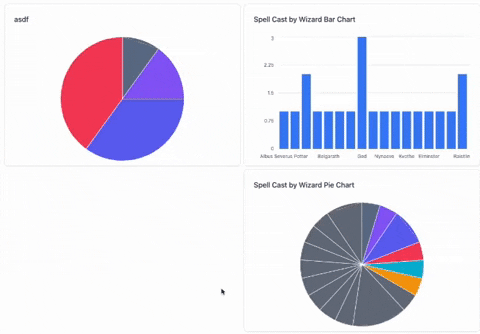
And... Voilà! Once you have enough data to display everything, it should look something like this:
To make things a bit more interesting, how about we throw in an "Add Chart" button so we can dynamically pop in a chart based on the data we have?
I'll be using a new library called Floating UI for the dialog.
In the dialog, I'll allow the user to select the chart title, visualization type (bar/pie chart), the event type from the database, and one of the properties associated with this event.
In a new component that I've named AddChartDialog, I'll incorporate this code:
<FloatingPortal>
  {isOpen && (
    <FloatingOverlay className="Dialog-overlay" lockScroll>
      <FloatingFocusManager context={context}>
        <div
          className="bg-white p-6 rounded w-[35rem] flex flex-col"
          ref={refs.setFloating}
          {...getFloatingProps()}
        >
          <Title className="text-2xl">Add Chart</Title>
          <Subtitle>Visualize your events</Subtitle>
        </div>
      </FloatingFocusManager>
    </FloatingOverlay>
  )}
</FloatingPortal>
We can now integrate Select components (also sourced from tremor) inside your dialog. For instance, we could include a Select component for choosing an event schema:
<div className="mt-4">
  <div className="mb-2 text-sm">Event Type</div>
  <Select
    value={eventSchema?.id}
    onValueChange={(schemaID) =>
      setEventSchema(
        eventSchemas?.find((schema) => schema.id === schemaID)
      )
    }
  >
    {eventSchemas.map((schema) => (
      <SelectItem key={schema.id} value={schema.id}>
        {schema.id}
      </SelectItem>
    ))}
  </Select>
</div>
Note: I could have implemented a more robust form validation system using the react-hook-form library, for the dialog of the "Add Chart" button.

For the complete context of what I've discussed here, and to get a glimpse of the entire project (including the backend), take a look at the repository of MagicInsight.